Bringing the Japandi aesthetic into your home
Incorporate the philosophy of ‘Japandi’ into your family spaces, using textured paint in a variety of beautiful shades to evoke the calm and minimalism of Japanese and Scandinavian culture, respectively.
Japandi is a popular emerging interior design trend that fuses the Japanese philosophy of ‘wabi sabi’ with the Scandinavian practice of ‘hygge’. ‘Wabi sabi’ is a way of life that embodies slow living, contentment and simplicity, finding beauty in natural imperfection. ‘Hygge’ is the word for a mood that is all about comfort, cosiness and wellbeing. Japandi is centred on tranquil, minimalist, and functional interiors that support a healthy, meaningful lifestyle. The distinctive style of Japandi has a deep connection to the earth and nature. It merges sleek, functional Japanese elegance with Scandinavian-inspired modern minimalism. The result is harmonious, tranquil and warm aesthetics through furnishings and paint colours.
Jotun Paints’ latest addition to their premium interior textured paints collection is ‘Touch of Suede’, a paint that offers a unique matt finish with a brushed rustic look. This subtle yet luxurious touch brings interior spaces to life and is ideal for inspiring Japandi interior styles. By including calm and neutral colour palettes with contrasting darker and natural hues, ‘Touch of Suede’ paint embraces the relaxing grace of Japandi with a textured flair.
Below we look at a selection of paint colours from Jotun’s collection that can create Japandi aesthetics when layered with minimalist furniture in your home.
WOODSMOKE
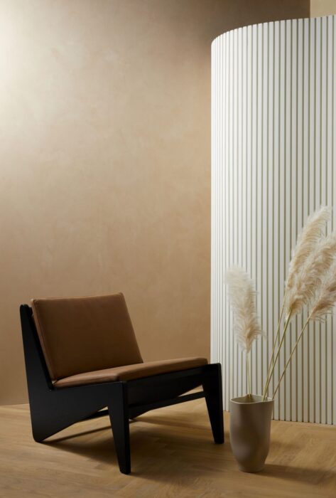
This muted beige with yellow undertones makes a perfect addition for evoking an organic and calming effect, synonymous with Japandi styles. Consider pairing it with warmer wooden furniture and contrasting accents, such as dark black or cool whites, for a welcoming look that is easy on the eye. Blending Scandinavian furniture with clean symmetrical lines also adds to the simplistic charm of this hue.
SABLE STONE
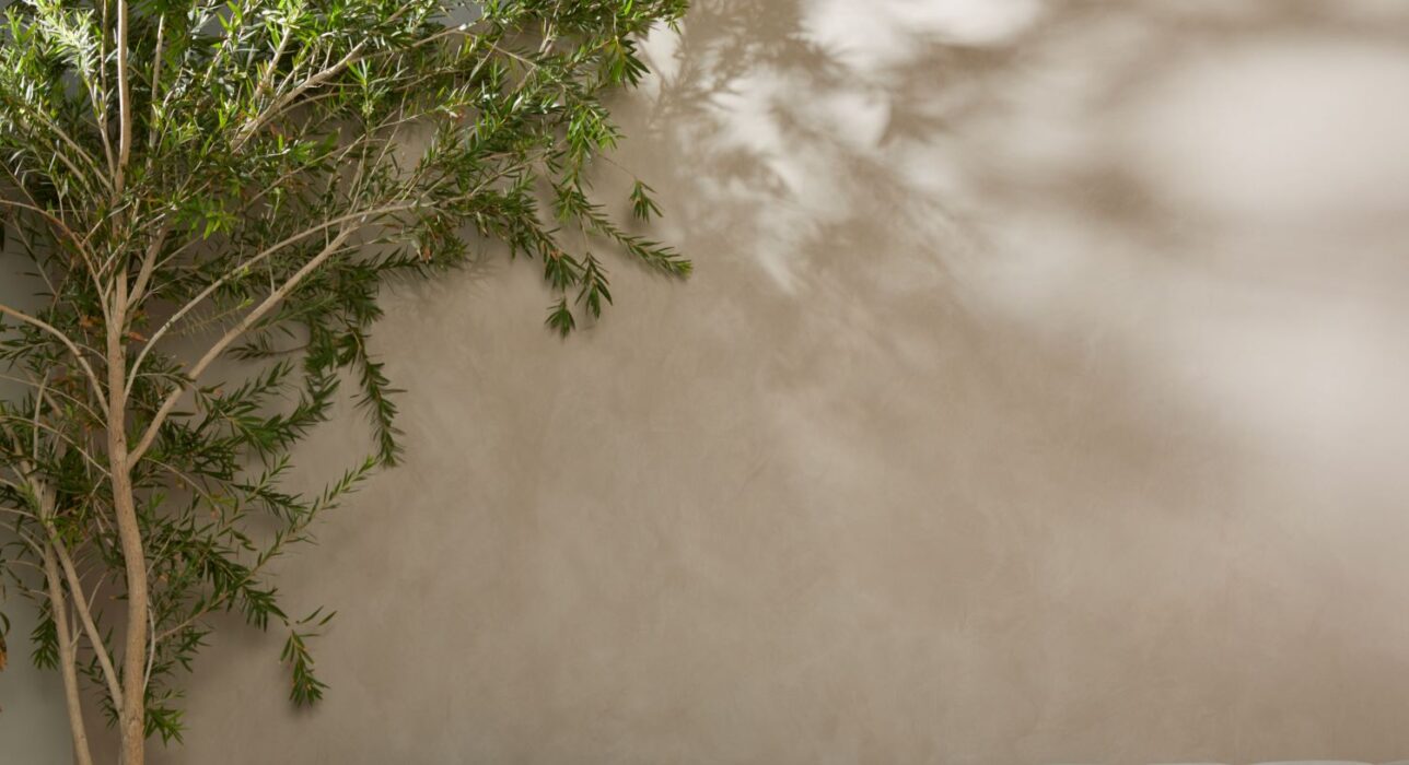
Giving off a timeless appeal, this muted grey is ideal as a background that reflects the earthy tones in Japandi-inspired interior design. Contrast it with house plants, ceramic accessories, warmer neutral furnishings and loads of natural light to balance the ambience.
ANTIQUE YELLOW
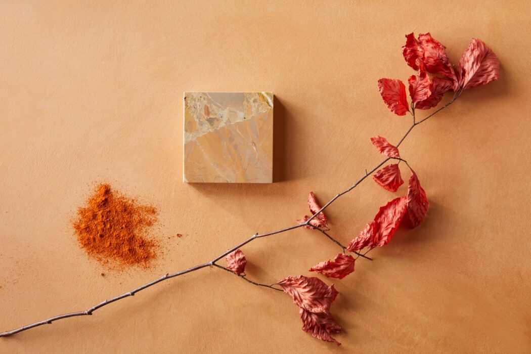
This warm yellow tone is great for accommodating light and darker-coloured furniture, while creating an antique-inspired feel. Using simple furnishings with a single pastel colour can enhance the overall vintage sensibility of your room, while making the space look clutter-free – a key aspect for achieving the Japandi aesthetic. This hue delicately positions itself without reading too yellow or too orange, instead helping you attain a homely atmosphere.
SENSES
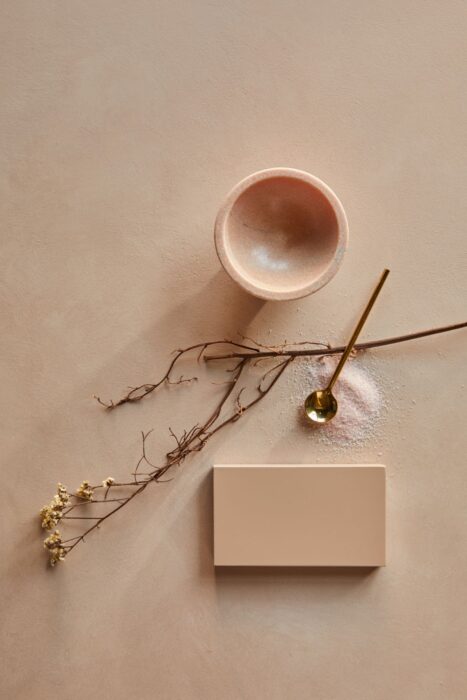
This golden pink paint choice exudes the airy and delicate mood commonly associated with Japanese styles. The colour works well as an accent to greyish muted tones and can be incorporated in functional accessories, such as vases and open shelves, to showcase the simplicity and practicality of Japandi.
You can learn more about Jotun’s ‘Touch of Suede’ paints by calling 800JOTUN or using the Book-A-Painter service on www.jotun.com. The paint can be purchased directly from any of Jotun’s authorised retailers in the UAE.


Comments